Tableau Tutorial
Make a map using a Google Sheet and shapefile
In this tutorial, you will prepare a Tableau Dashboard with a map and chart by connecting to a Google Sheet and a shapefile (in zip format).
1. Prepare Data
Open Tableau (Desktop or Public) and connect to the tabular and spatial data.
1.1 Connect to Google Sheet
- Copy this Google Sheet into your Google Drive (requires USAID account; if you do not have access to this Sheet, you can follow this tutorial with your own dataset).
- Under 'To a Server', select "Google Sheets". Tableau will attempt to connect to the Server. If you use multiple Google profiles (i.e., you have a separate profile for personal and work), make sure the correct profile is active (open your browser and load a tab under that profile) before selecting "Google Sheets". Select the appropriate account and 'Allow' access.
- Select the Google Sheet you want to connect to from the list shown in the 'Select Your Google Sheet'. You should have access to sheets owned by you and sheets shared with you.
1.2 Connect to Shapefile
- First, you must prepare or download a shapefile. The shapefile must be joinable to the Google Sheet you selected (i.e., have at least one shared field). This shared field will be a unique identifier for the geometry you want to display. For this tutorial, save the departments.zip zipped folder to your local computer.
Note
You can find geometry data in the ArcGIS Online hub under Content > Organization. Filter by Layer Files to find suitable data. Hover over the image (often just a view of the world) and select Download, or open the file and Download as Shapefile.
-
In the 'Data Source' tab of Tableau (which should be open now), under Connections, select "Add".
-
Select "Spatial File" and navigate to the zipped file containing the shapefile you want to use.
1.3 Join Shapefile and Google Sheet
In this step, we want to attach a geometry to each attribute we want to illustrate.
-
In the Data Source tab of Tableau (which should be open now), remove the spatial data file from the GUI window. Drag a table that can be joined to the spatial data from the Google Sheet into the GUI window. Double click the resulting box to open the Join window.
-
Drag the shapefile into the Join window. Select the join fields from the left and right data sources.
Tip
We have found that a Join, rather than a Relationship, is best for spatial data. For some reason (which may be a bug addressed in future Tableau releases), numeric fields in shapefiles are read as string type fields and cannot be joined. If necessary, use the dropdown on the shapefile's join field to convert to integer using a Join calculation int([Codigo1 (muni geo1)]).
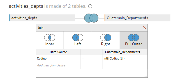
In the above example, we've added a table of activities and the associated departments and used a full outer join to join the shapefile to the data. In this way, we don't lose any activity data and we show all departments, even if no activities are currently taking place there.
- To be extra speedy, start by double-clicking the table in the tabular data that can be joined to the spatial data. The Join GUI should open. Next, Add a Connection and navigate to the file. The file should be joined automatically. Double click the venn diagram to edit the join type.
2. Create map
Next we will symbolize the data, in our case by showing the number of activities per department.
2.1 Add Geometry
- Navigate to the Sheet tab. Rename it by clicking the tab handle.
- Locate the geometry feature in the right sidebar associated with the shapefile you are using. It should be indicated by a globe icon and be named Geometry.
- Drag that feature into the canvas. A map should appear showing the spatial data.
2.2 Specify a Detail by which to Disaggregate
- You must specify as a Detail an attribute within the spatial file to disaggregate measures by. Most often, this will be the name or other identifier of the features you are interested in. In other words, if you are mapping information by country, drag the country name attribute to the Detail pane. In our case, we will drag the Department name field in.
2.3 Symbolize Data
- Next, drag the measure or attribute by which you would like to symbolize to the Color option of the Mark pane. This will create a choropleth map. You may need to use the dropdown by the attribute pill in the Mark pane to convert it to an attribute or measure, or specify it as continuous or discrete.
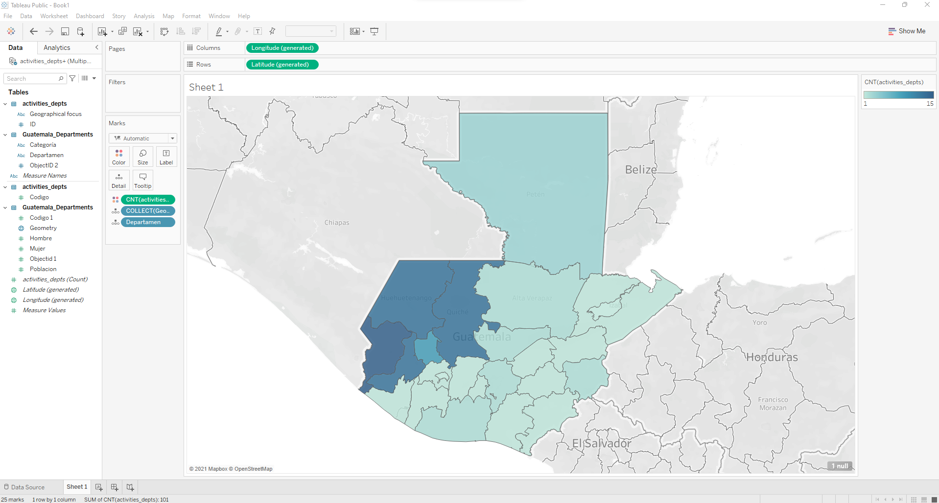
- Change the colorscheme by clicking the color icon next to CNT(activities) in the Marks card and create a custom sequential (or diverging) colorscale using USAID colors (#002F6C is the standard blue).
3. Connect additional tables
Now we will connect additional tables to allow us to summarize additional data available in the Google Sheet.
3.1 Add additional table relations
- Navigate to the Data Source tab. Close the Join window if necessary.
- Select the Google Sheet in the Connections pane.
- Drag the desired table into the canvas.
- Click the join spaghetti to select the relationship. Select the shared field for each table.
3.2 Symbolize additional data
-
Navigate back to the sheet with the map.
-
We will add another map layer to symbolize a different attribute. Drag the Geometry attribute over the canvas until a popup in the upper left says ''Add a Marks Layer". Drop the Geometry attribute in that card.
Tip
Instead of adding another layer, you could display these data as a Tooltip or Label. Later in this tutorial, we will look at bivariate choropleths as a way to compare two datasets by spatial feature.
-
Add the same Detail you did in step 2.
-
Add a measure or attribute to symbolize.
-
Rename both Marks layers so they can be distinguished easily. You can also click on the icon to the left of the name to hide one or the other. When deployed, only one layer should be visible.
Note
Notice the layer control icon is now available on the map (it looks like a stack of squares). You (or your users) can now turn layers on and off with the layer control.
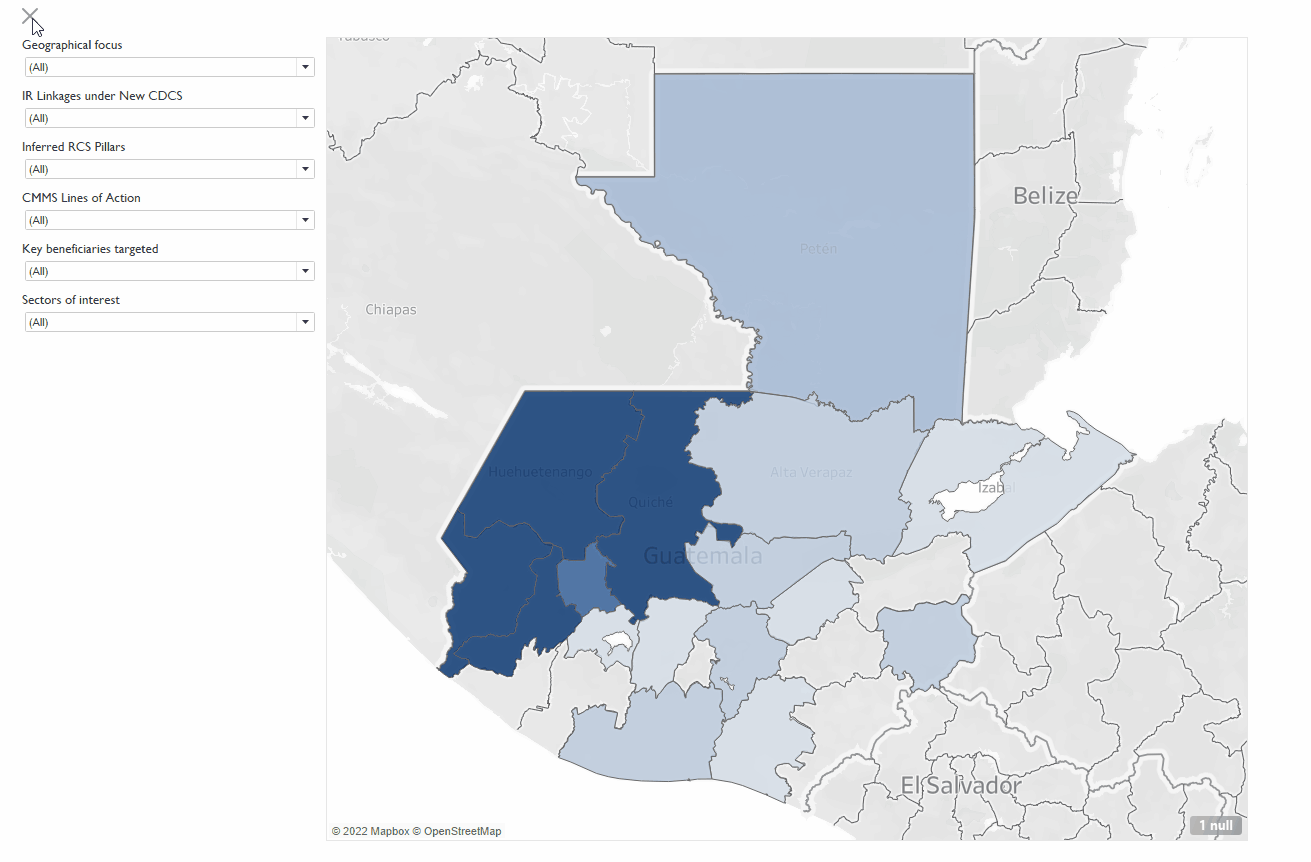
3.3 Add a Filter
A filter will allow us to filter data by an attribute of our choice.
- Drag an attribute to the Filter pane. A dialog box should pop up allowing you to configure the filter. I recommend using all (including null) at least for now.
- Click the dropdown on the filter pill and select 'Show Filter'. The filter should appear in the right sidebar. You can adjust many options for the filter, explore by clicking the dropdown to the right of the filter's card. Set dependent filters by setting the subdominant filter to show 'Only Relevant Values'. For example, to filter first by Lead Office and next by Activity name, set the Activity name filter as 'Only Relevant Values'. When you select the Lead Office, only the Activities by that Office will be available in the Activities filter.
- To remove specific values from a Filter, use a Filter Set. Right click the attribute in the data pane and select Create Set. Select all options except the ones to remove. Then remove the original filter (if needed) and add the Filter Set to the Filter shelf.
4. Build a Dashboard
4.1 Add Map to Layout
- Click the New Dashboard tab at the bottom of the window to create a new dashboard
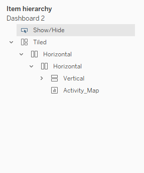
- Drag the Activity_Map sheet onto the canvas. The map should display and the filters should be attached to the map area. Ideally, the filters would be added within a Vertical tiled container. If not, you may need to drag a new Vertical object next to the map and redistribute the filter elements.
- The Item hierarchy (click the Layout tab of the left sidebar) should look like this (excluding the Show/Hide element for now). This will become important when creating the Collapsible Filter Bar. The Activity_Map and Vertical Container storing all filters must be in the same Horizontal (not Tiled) container for the map to auto-expand when the Filter Bar is collapsed.
4.2 Stylize
- On the top menu, select Format Workbook and change all fonts to Gill Sans MT. You can also edit fonts at the Dashboard level, which provides more options.
- Under the Dashboard tab in the left sidebar, set the size as 'Range' and increase the max width to a comfortable size that fills the screen without over-expanding. Tableau will use these min and max sizes as media queries to re-arrange content depending on screen size. Nicely, it will stack content for narrow screen sizes like phones. A special 'Phone' view is automatically created. Click it to see how the auto layout looks, and you can customize this if you need to. You can use the Device Preview button to preview the Dashboard on a variety of different standard device types.
- You can also change padding (Inner Padding), margin (Outer Padding), background color, and borders around the Dashboard as a whole or individual containers.
4.2 Add Collapsible Filter Bar
Allowing the user to collapse the filter bar provides a nice user experience.
- Select the Vertical container holding the filter elements (double click on the handle above an individual filter element, or use the Layout tab of the left sidebar). Click the down arrow (or right click the element) and select 'Add show/hide button'. This button will be added as a floating element. I decided to add a small vertical container across the top of the Dashboard to provide space for this button, and I can also use the space to title the map while keeping the filters all top aligned. In the button's options, you can change how it looks and add a tool tip like "Click here to expand all filters".
Tip
To add additional filters to the Dashboard, first add the filter to the Activity_Map worksheet by dragging the field from the left sidebar into the Filter card. Next, select the drop down arrow on the filter pill and select 'Show Filter'. Customize the filter in the Map as needed (e.g., change to multi-value dropdown type and select the option for Only Relevant Values). Next, go to the Dashboard and select the map element. Use the drop down arrow and hover over filter from the menu, a sub menu of available filters will be shown. Click on the newly created filter to add it to the filter pane. You may need to drag it to the appropriate container.
5. Add Table of Activities
Next we'll add a table showing all activities that will filter based on filters and selections on the map.
5.1 Create Table
- Create a new Worksheet and rename it Activity_Table.
- Drag the columns you would like in the table from the left sidebar to the 'Rows'
5.2 Stylize the Table
- Add alternating row shading by clicking 'Format' in the top menu and selecting 'Shading'. Select the Rows tab from the newly appeared left sidebar. Select the color for alternating rows from "Pane". Ensure band size is set to 1. Level should be 0.
- Increase padding between rows under Format > Cell Size > Taller.
- Set the Table to 'Fit Width' so that it will expand with the viewport (top menu bar where it says 'Standard').
5.3 Add a Tooltip
Tables are set up so that hovering will expand the content of a cell, which is helpful when the text exceeds the column width. However, it means that a tooltip cannot easily be added to a table to show additional information on hover (although it is possible with some trouble). Instead, we'll create a dedicated column for the tooltip called 'More info'. This approach has the added benefit of solving for the 'Abc' placeholder column at the same time
- Under Analysis, select Create Calculated Field. Set the Calculated field to be the string "More info".
- Drag the calculated field into the "Text" Mark.
- Drag the fields that you would like to show in the tooltip into the Tooltip card.
- Double click the Tooltip card and customize the tooltip. Use the 'Insert' to add references to the attributes you want in the tooltip (you cannot just type open and close brackets).
- You can change the font for this field by selecting Format > Font, select the 'More info' field from the dropdown menu for Fields, and under 'Pane' set the font to italics or however you would like to set it apart.
5.4 Add to the Dashboard
- Add a new container for the Table and pull the table into the container.
5.5. Add a Search Bar
A search bar can help when you have a long table that you need to find specific rows within. When the table is also a filter (see step 6 below) the combination of search and select allows for quick filtering. We'll also add an informational tooltip to help users with this feature.
- In the Dashboard, select the Table element and click the drop down arrow (or right click the table). Hover over 'Filter' and select the field which you want to use as a search field. A filter should appear.
- Change the filter to 'Wildcard' type.
- Position the search bar in the Dashboard. Leave room to the right for an informational icon.
5.6 Add informational icon
This step can be duplicated for any number of informational icons that have tooltips.
- Create a new worksheet and name it 'Search_Info'
- Drag any attribute to the canvas. I created a new calculated field called 'Blank', but it really can be anything.
- In the Marks card, change the mark to a Shape. Select 'Shape' and navigate to the shape you would like to use. If you want to add your own shape (I used a search glass icon), download a free icon image from the web and save it in the folder 'My Tableau Repository' in your 'My Documents' folder under 'shapes/'. Then open the Shape dialog box again, select 'More Shapes', and hit 'Reload Images'. You should see the image in the Custom Palette.
- Remove the column header (click the dropdown in the Rows button and uncheck Show Header)
- Remove the borders from the top and bottom of the element under Format > Borders > Row Divider > Pane = None.
- Double click the Tooltip icon in the Marks card and update the text with the info you want to include. Uncheck 'Include command buttons' and 'Allow selection by category'.
- Return to the Dashboard worksheet. Drag the Search_Info worksheet to where you would like it on the Dashboard. Under the container elements, adjust the icon to fit Entire View.
Tip
Another option for adding information and instruction is to use a show/hide button on an image that creates an image overlay with instructions for the Dashboard. Unfortunately, this will only work with fixed size dashboards as the image has to be static.
6. Set up Cross-filtering
- Under Dashboard menu, select Actions. Add Action (select Filter) and set 'Run action on' to "Select"and then below it under 'Clearing the selection will' select "Show All Values". Click OK. The source and target should both be Activity_Map and Activity_Table, which will allow you to use either the map or the table to filter records.
Note
In Dashboard mode, you can connect filters across sheets by selecting (in the filter card) Apply to Worksheets and selecting an option within the dropdown menu.
Conclusion
That's it! You should now have a functional map-forward dashboard that allows all kinds of filtering to help find the information you need.
Bonus: Embed in a Google Site
For extra credit, embed the Dashboard in a Google Site.
See this guidance for options on import of the Dashboard.